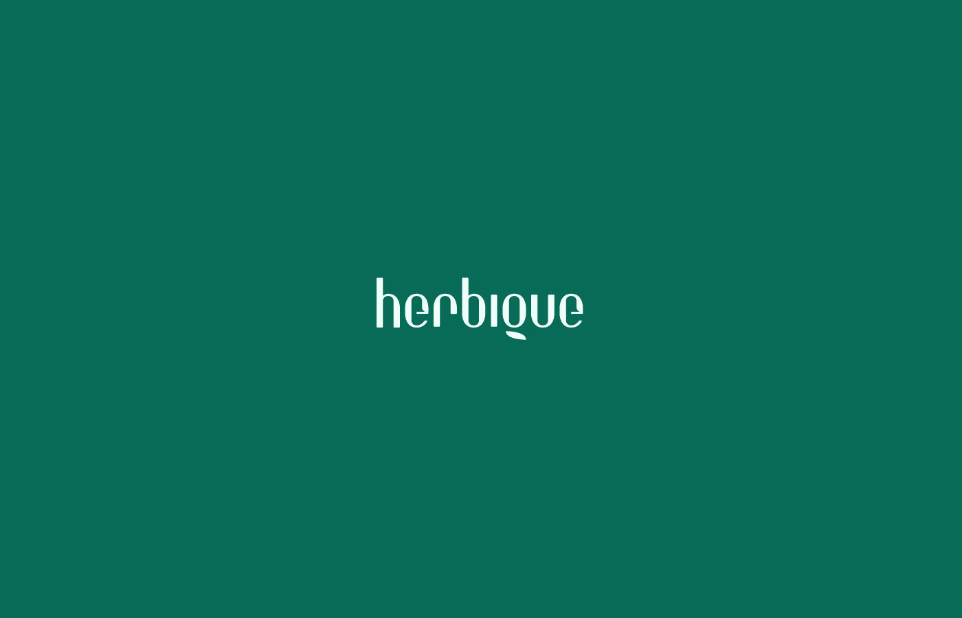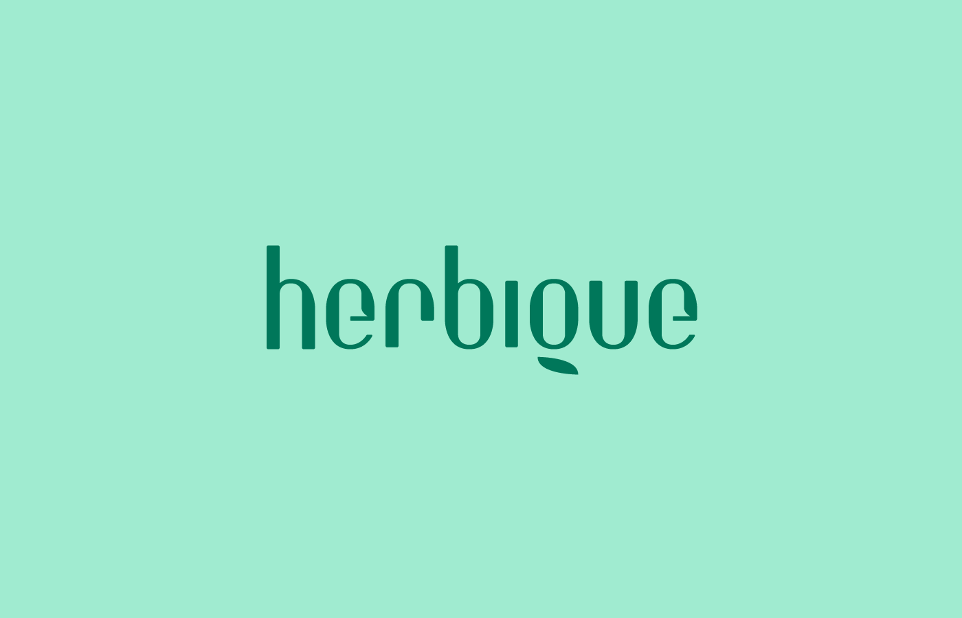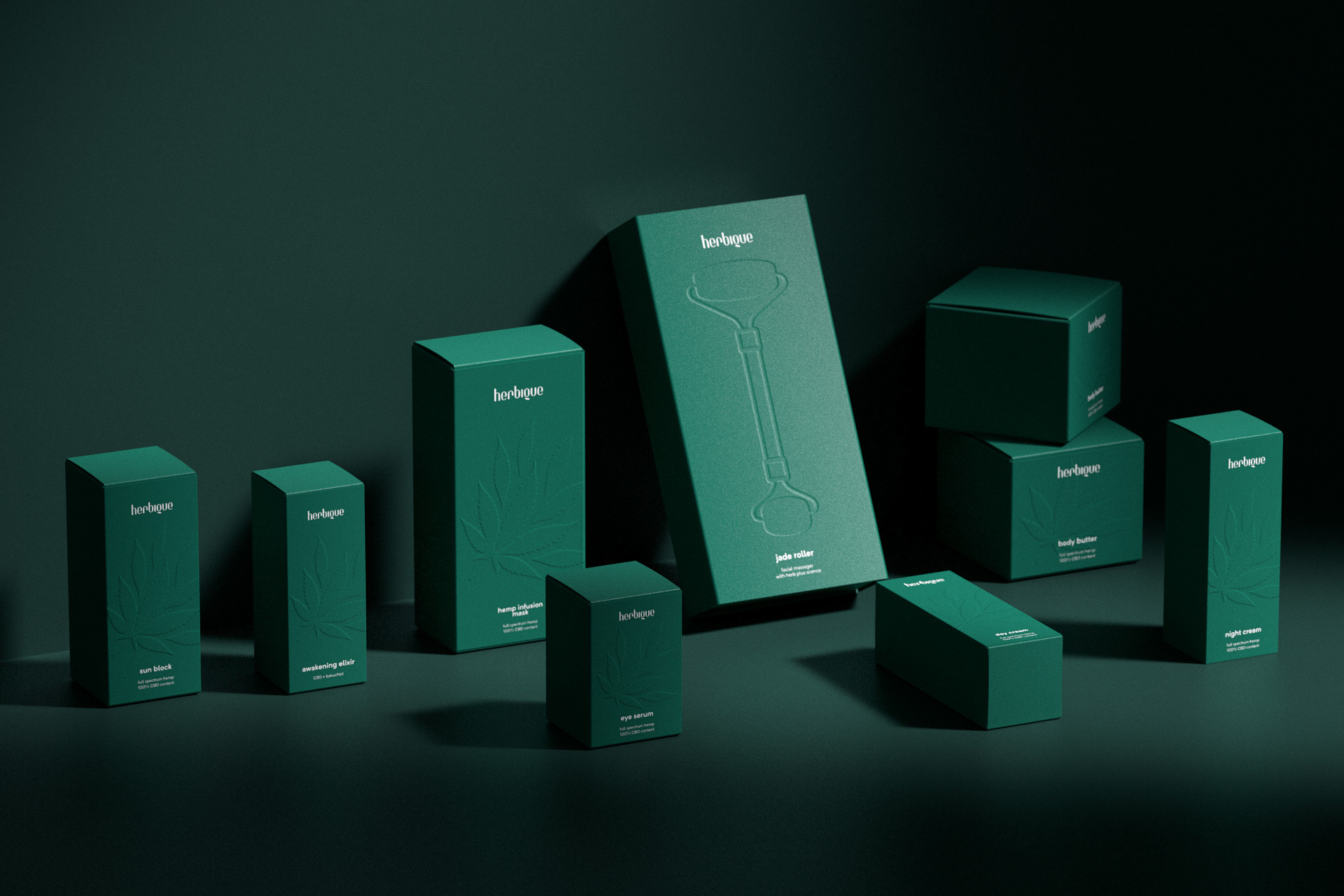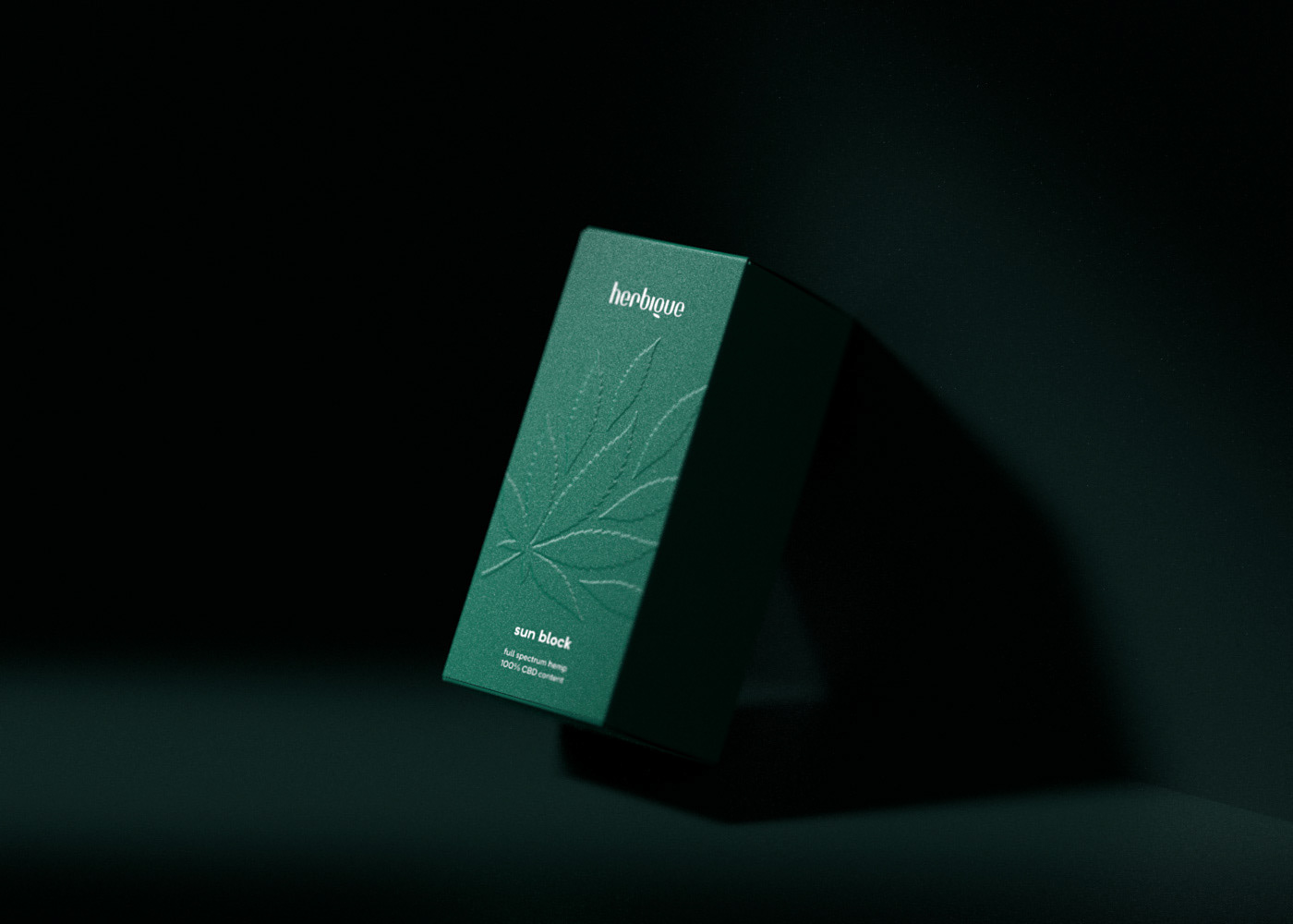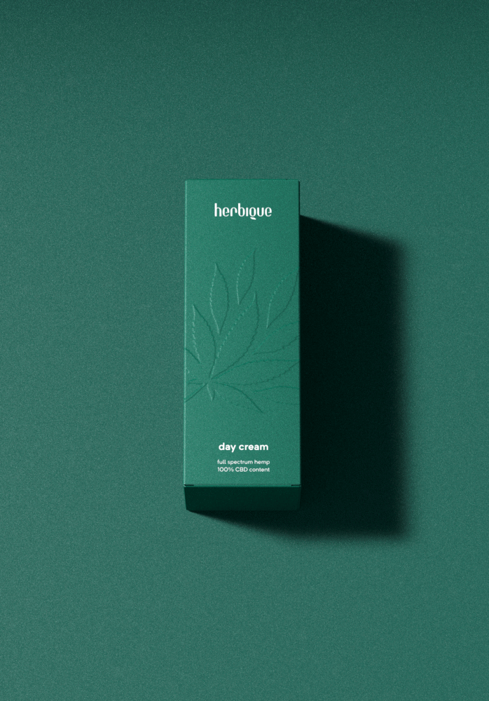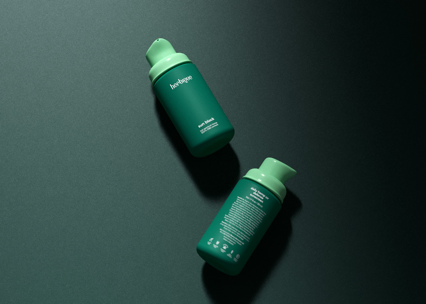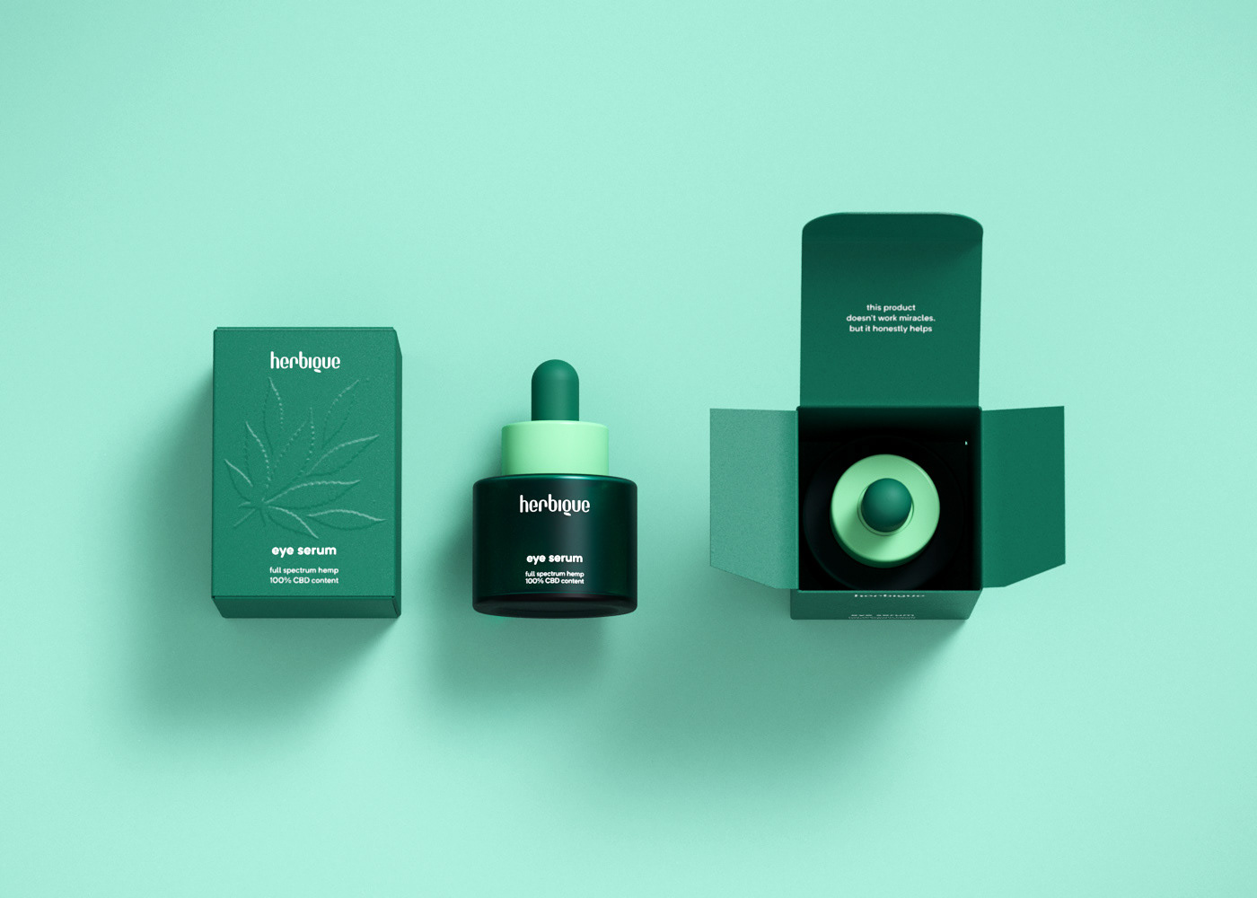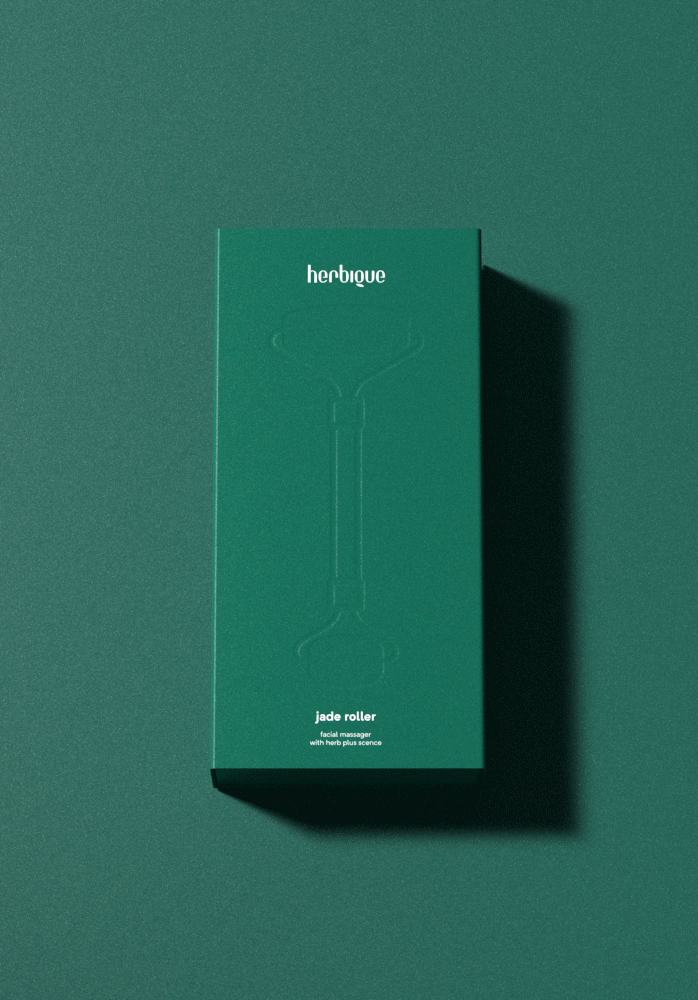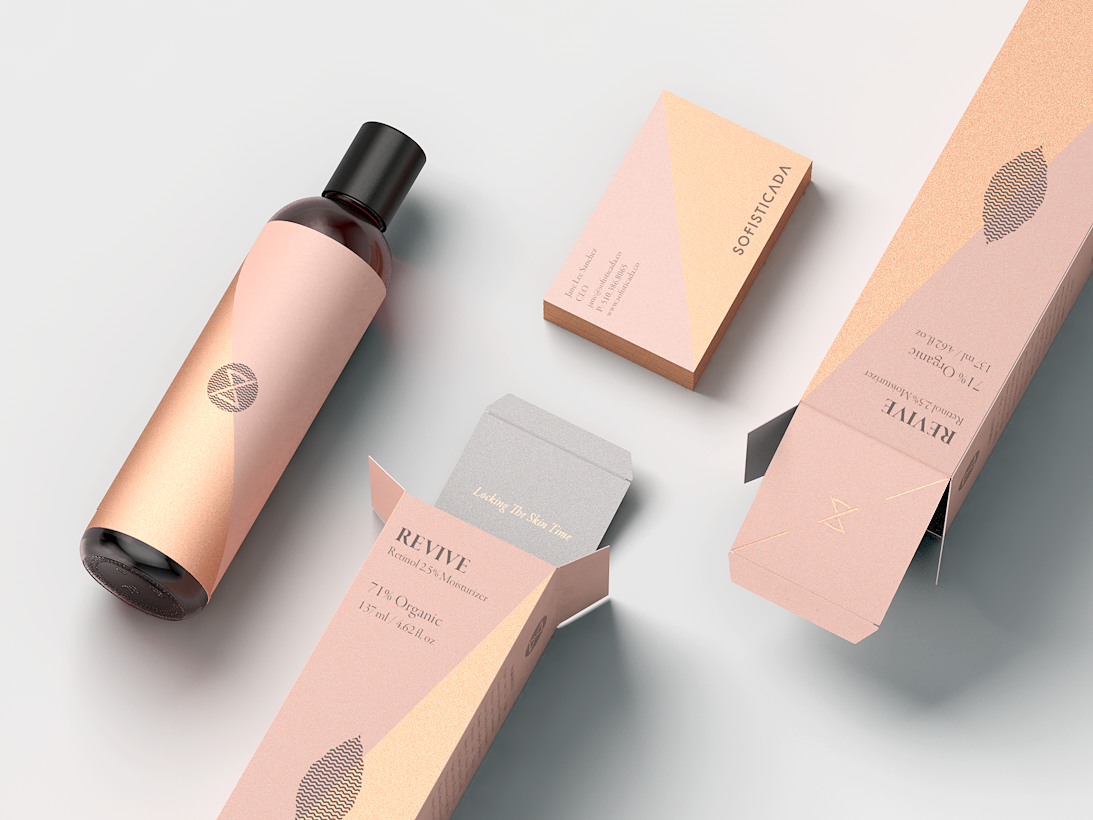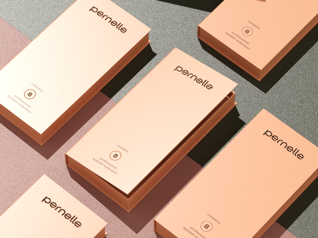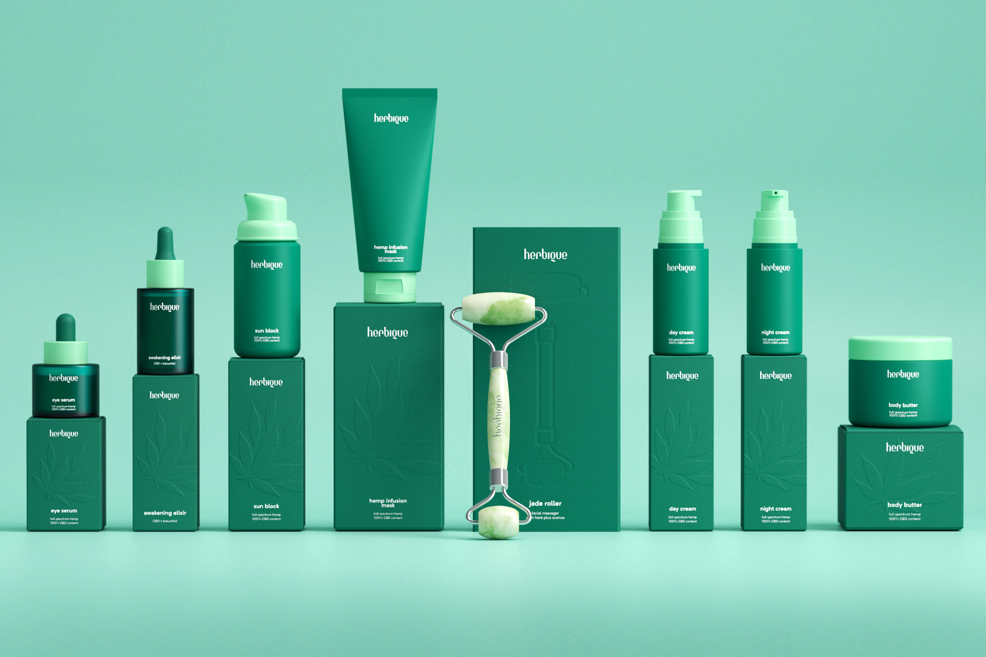
I was commissioned in 2019 for give life to the brand visual identity and packaging. The journey taked us two years for can bring to the life this creation. on the way lovely concepts was forget, refinements and refinements to obtain this result that we really belive is strong and depurated. The logotype is a tribute to the subtle, the nature, the herbs, the green. and with a high responsabilty to communicate and smell like nature with few views by the viewer. For be dominant from the subtle with a air of elegance. The logotype was made from the scratch and take me few months to be completed.
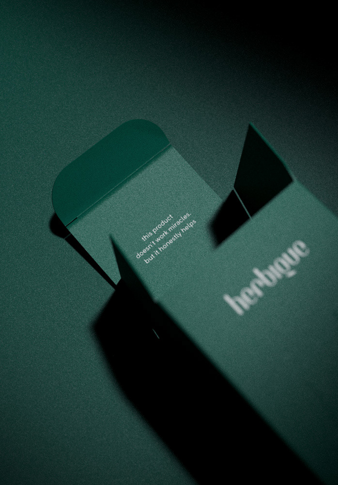
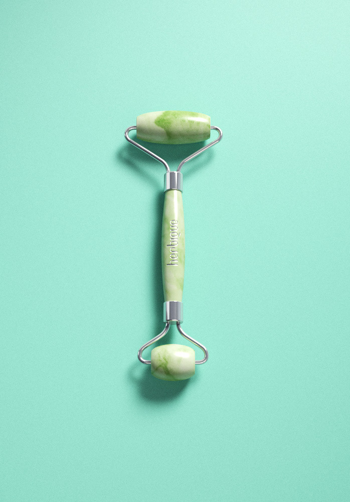
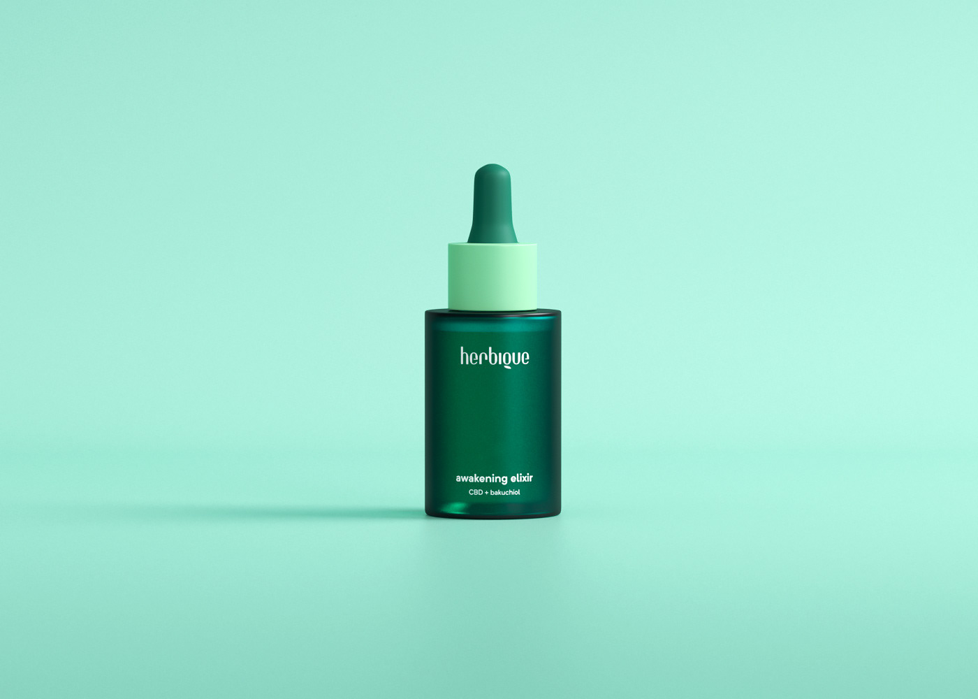
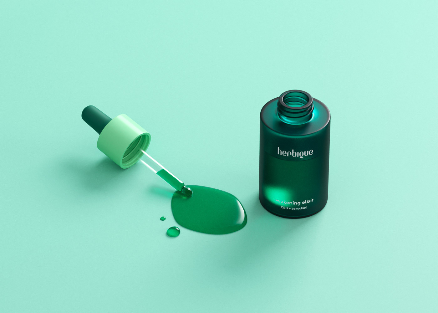
The brand will be reconized from three pilars, the green, the logotype, and the blind embossed corresponding to the main ingredient. In the future can be a coconut leaf brach or a lemon branch. Our intention is be simple in the communication without complex and improbable concepts. This is a brand from CBD & Hemp Infusions that work for you & our planet " this product doesn’t work miracles, but it honestly helps"
Note: I want to give special thanks to the DOTSTUDIO Team for support me with prints and papers consulting for the packaging, really thank you Matt ;-)
For more the my work in progress and upcoming work... Instagram